Thursday, September 16, 2010

Some flyers I've come across

With this one for Negru, I could take or leave the imagery, it's not really that interesting, but the layout of the typography is really appealing to me. It's also really strict with its colour choices and I really like that.


I like the quality of the photograph for this one, I'm not keen on the subject but the colour in the background is nice. The type is interesting too, and the use of the multiply tool is well done. It's popular and I like how it's been used in this one.

Monday, August 30, 2010

Website

As I rebuild myself with an identity and design presence I find more interesting, it's important to build a website that suits this. So I guess what I was interested in was the identity I'd created in PPD and how to apply that to a website setting. I'd taken a photograph of my little set up over summer, it kind of summed me up at that point and it was just a really nice black and white photograph. So, I thought I'd use it.


Here's a kind of welcome page, I like something like this, where it creates an ambiguity and some insight into personality. The book is something I found at the start of summer in a charity shop and it's influenced so much of what I've been looking at over summer and some of the briefs I've written for next year, so it's very apt.

Here's the basic layout. The main part will have thumbnails (when I actually have thumbnails to work with.) they'll then have a light-box window come out with the full images to scroll through. I aim to have this up and ready by Christmas. In fact Christmas is my deadline for this stuff. If I don't do it by then I will have stern words with myself.

Monday, August 23, 2010

Mortality Series

Looking at the shape of tomorrow zine, I've looked at interpreting the idea of circle in terms of the circle of mortality. That being said, I've created a series of designs meant for prints, which I'm going to screen print and photograph upon my return. I'm a little worried that I'm over using the halftone dots though, so after this piece, no more half tone for at least a while. I stuck in the hand prints from my collaboration with Daisy because they're really appropriate, I'm not sure whether I'll stick with them or not though:

I think for the book I'll just use the first and last prints. The symbols over the top are the Greek symbols for life and death.

Sunday, August 22, 2010

Collaboration with Daisy from Fashion


Basically Daisy asked me to come up with some designs for some clothing she had designed. She wanted something quite dark and messed up. I've been sitting with these skeleton hand designs, not knowing what to do with them for a while and I figured they'd look really strong on a t-shirt/baseball sweater. Thankfully Daisy agreed and we're going to screen-print some samples when we get back to Uni. As far as I'm aware skate shop in Dorking where she resides outside of uni hours is already interested in stocking them which is awesome. Here are the range of garments with the designs applied to them:

Saturday, August 14, 2010

Gang of New York posters

Watching Gangs of New York, I was really drawn to the very unique colour schemes and symbolism of the different gangs. As a quick exercise (I reckon including the time to draw up the components I spent about 4 hours on these) I generated some film posters based on these really clear elements.


This is the first layouts for both, I wasn't really satisfied with the layout for the dead rabbits, but the layout and incorporation of the stripe pattern on their 'uniforms' worked well and was a good foundation.


So I settled on this as a layout. I'm really happy with the results, and I think they have a real professional quality to them.

Friday, July 30, 2010

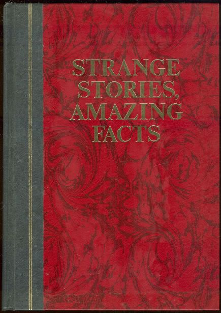
strange stories, amazing facts

Reader's Digest Strange Stories Amazing Facts, ca. 1976

I bought this book from a charity shop, it has been no end of help coming up with interesting briefs for next year. For instance there's a society called 'The Flat Earth Society' who still believe the earth is flat. I love the idea of doing design to persuade people about such an indefensible viewpoint.

There's also quite a bit on conspiracy theories and such which is great for the Manchester book fair that Amber is calling for us to enter.

I LOVE THIS BOOK!

Thursday, July 29, 2010

More circle trends


Another bit of album artwork following the trend. I'm not as in love with the perch patchwork element of this, but I love the type for the band name, which I believe is part of the Gill family or at least something similar. And we all know how I feel about Gill.

Friday, July 16, 2010

10 Bands with Awesome Names

OK, so I've been working on this project pretty much since I've left. I haven't exactly recorded every stage of what I'm doing, or in fact any. But essentially I've tracked down band names that I think are amazing, I've created a logo form and turned each band into an editorial. Both these things are something I haven't really done before and I don't know why, so I really had a crack at it:


I'm actually really happy at where it ended up. I'm going to manufacture and photograph it for real when I get back to university (I have no facilities up here to do so). But I think it's a nice portfolio piece for my new direction. I chose to work with Gill font family because it's one I haven't used before, and I'm actually growing rather fond of it. I was originally going to create a typeface for each band as a title font. I started doing it for Sperm Javelin, but it's not something I enjoy doing, and not something I'm going to pursue any further.

Tuesday, July 13, 2010

Tarot

I'm also intruiged by the tarot. Now I think it's a load of guff, but the illustrations and their symbolism, I do find alluring. The layout on these things is also quite interesting.


I think redesigning the Tarot could be interesting, but then I also think, who would want me to? What would it's function be? It's something to bear in mind, and the symbols are always going to be something useful to remember!

Sunday, July 11, 2010

Signs and symbols; the I-ching

I've always had a fascination with signs and symbols, I just wanted to show the way that some of these can be adapted to create a sense of ambiguity and mystery. I think half the fun of their uses is to decode the obscure, to be part of a limited number of people who get it. With that in mind, here is the I-ching and some examples of where it's been used recently.

Heres the original base symbols for the I-Ching, each with a specific meaning.


Here they've been appropriated by the Dharma initiative designs for Lost. The symbols a long with the pictograms really create an air of mystery which I absolutely loved when the show first came up.


And I noticed the other day perusing HMV that the symbol for 'creative' was rather cunningly used by this Jay-Z cover. I like that I get this and maybe a few other people do, but not many. The colours in this also happen to be used excellently.

Saturday, July 10, 2010

Some nice design


This is just some design I like. The layout is excellent and the colour choice is really nice. Good strong colour identity really appeals to me. This circle thing is being done quite a lot these days though, including me and my awesome band names project.

Friday, June 25, 2010

pulled apart by horses album cover


I love the colour quality to this photograph and the hand drawn type is nice despite legibility issues. Also, rounded corners on photographs, when done well, looks effing cool.

Thursday, June 3, 2010

The Shape Of Tomorrow

The shape of tomorrow is a collaborative editorial brief initiated by myself and Kenneth Moore, who I collaborated on the exhibition with last year. The idea is to get as many designers to submit an image based on conceptually interpreting a shape. Each issue is a different shape, starting with circle, followed by triangle, then square and finally cross.

http://www.facebook.com/#!/event.php?eid=120849711281459&ref=mf Here's the facebook group for the first page, we gave ourselves a head start by starting it over summer, unfortunately this meant that facebook was the only way to communicate with the vast amount of course mates over summer.

They're mostly awful, but I think we're getting there. We'll probably simplify it to the barest points, maybe even just utilizing the basic shapes themselves against a lot of negative space.