Friday, July 30, 2010
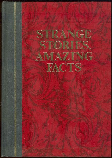
strange stories, amazing facts
I bought this book from a charity shop, it has been no end of help coming up with interesting briefs for next year. For instance there's a society called 'The Flat Earth Society' who still believe the earth is flat. I love the idea of doing design to persuade people about such an indefensible viewpoint.
There's also quite a bit on conspiracy theories and such which is great for the Manchester book fair that Amber is calling for us to enter.
I LOVE THIS BOOK!
Thursday, July 29, 2010
More circle trends
Friday, July 16, 2010
10 Bands with Awesome Names
OK, so I've been working on this project pretty much since I've left. I haven't exactly recorded every stage of what I'm doing, or in fact any. But essentially I've tracked down band names that I think are amazing, I've created a logo form and turned each band into an editorial. Both these things are something I haven't really done before and I don't know why, so I really had a crack at it:
I'm actually really happy at where it ended up. I'm going to manufacture and photograph it for real when I get back to university (I have no facilities up here to do so). But I think it's a nice portfolio piece for my new direction. I chose to work with Gill font family because it's one I haven't used before, and I'm actually growing rather fond of it. I was originally going to create a typeface for each band as a title font. I started doing it for Sperm Javelin, but it's not something I enjoy doing, and not something I'm going to pursue any further.
Tuesday, July 13, 2010
Tarot
I'm also intruiged by the tarot. Now I think it's a load of guff, but the illustrations and their symbolism, I do find alluring. The layout on these things is also quite interesting.
I think redesigning the Tarot could be interesting, but then I also think, who would want me to? What would it's function be? It's something to bear in mind, and the symbols are always going to be something useful to remember!
Sunday, July 11, 2010
Signs and symbols; the I-ching
I've always had a fascination with signs and symbols, I just wanted to show the way that some of these can be adapted to create a sense of ambiguity and mystery. I think half the fun of their uses is to decode the obscure, to be part of a limited number of people who get it. With that in mind, here is the I-ching and some examples of where it's been used recently.
Heres the original base symbols for the I-Ching, each with a specific meaning.
Here they've been appropriated by the Dharma initiative designs for Lost. The symbols a long with the pictograms really create an air of mystery which I absolutely loved when the show first came up.
And I noticed the other day perusing HMV that the symbol for 'creative' was rather cunningly used by this Jay-Z cover. I like that I get this and maybe a few other people do, but not many. The colours in this also happen to be used excellently.
Saturday, July 10, 2010
Some nice design
Subscribe to:
Posts (Atom)